In today’s digital age, a mobile-friendly restaurant menu is not just an option—it’s a necessity. With the increasing reliance on smartphones for everyday tasks, including dining decisions, ensuring your menu is easily accessible and navigable on a mobile device can significantly enhance customer experience and drive sales. This article explores expert tips and tricks for creating mobile-friendly restaurant menus that not only attract but also retain customers.
Understand Your Audience

When crafting a mobile-friendly menu, it’s crucial to consider the user’s experience on their device. The majority of your customers are likely to access your menu on the go, which means your design must be responsive, loading quickly and displaying correctly across different screen sizes. Prioritize simplicity and clarity to ensure that your menu is easy to read on a small screen, using legible fonts and contrasting colors for better visibility.
Navigating a menu should be effortless for the user. Implement a straightforward layout that allows customers to find what they’re looking for without excessive scrolling or clicking. Consider using categories or tabs to organize your menu items efficiently, making it easier for users to browse through sections such as appetizers, mains, desserts, and beverages.
Utilize High-Quality Images Sparingly
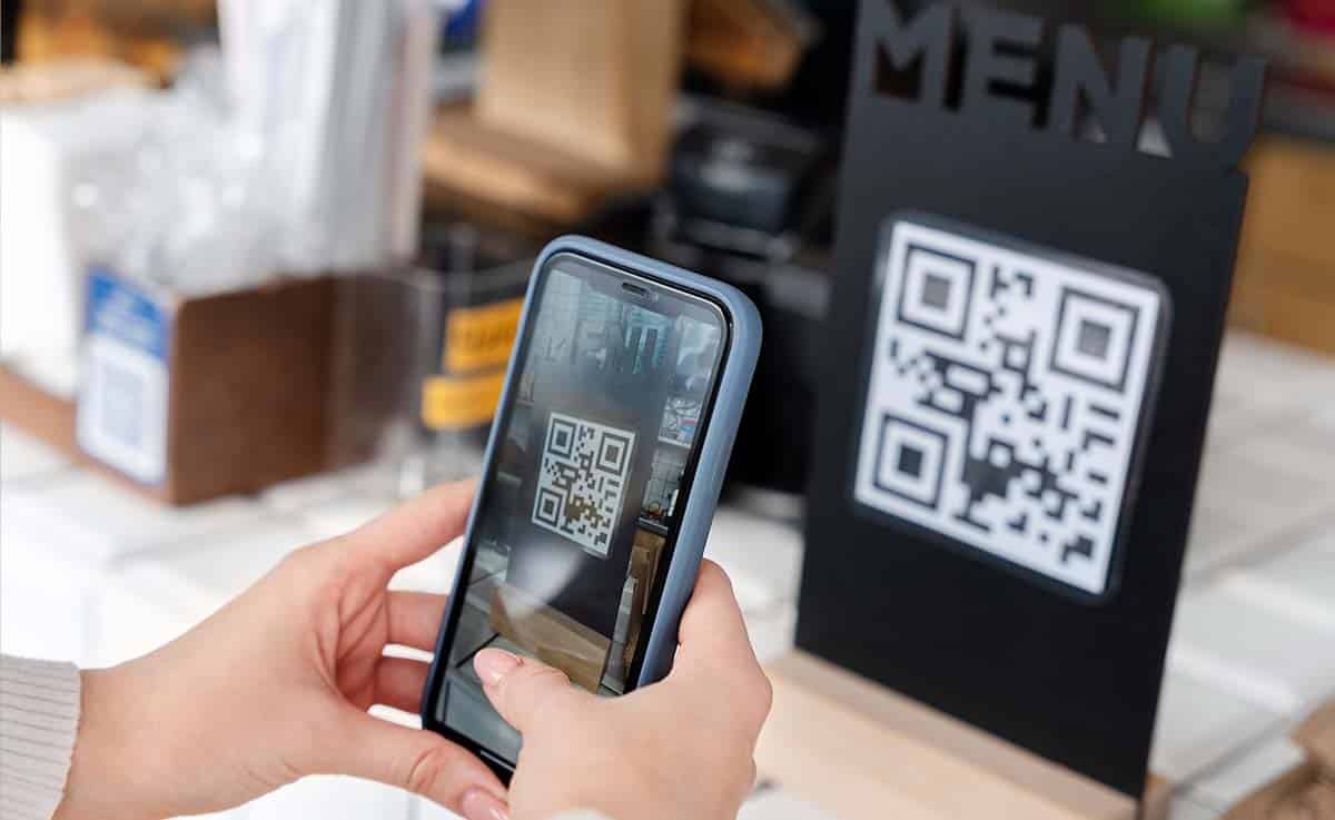
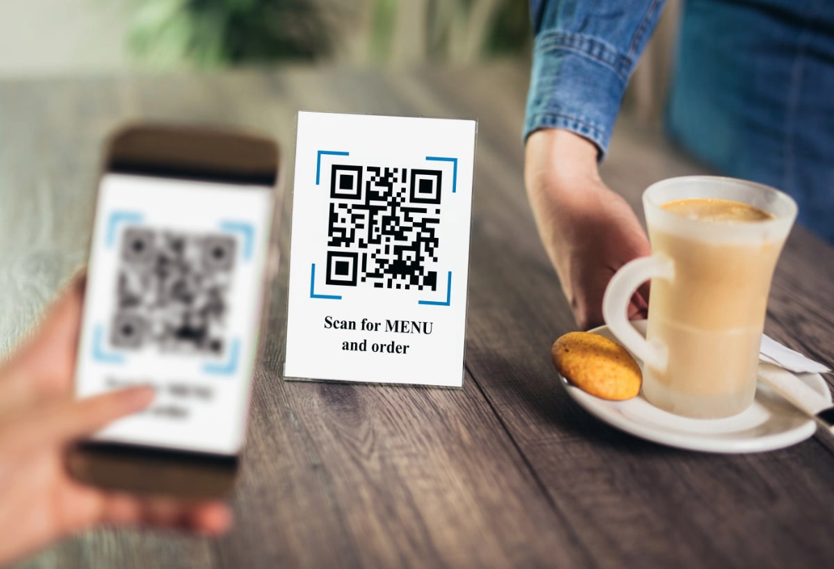
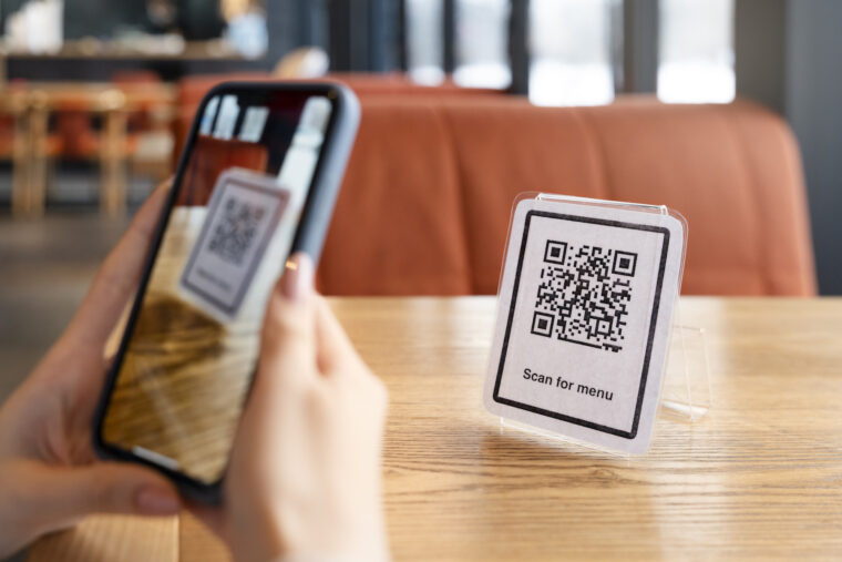
In the digital landscape of restaurant menus, striking the right balance between aesthetic appeal and functionality is paramount. While visually appealing, high-quality images can significantly increase the loading time of your menu, potentially frustrating mobile users with slower internet connections. To navigate this challenge effectively, consider employing a QR menu system. This innovative solution allows you to use images judiciously, opting for smaller, optimized photos that enhance the menu’s appeal without compromising its performance. With a QR menu, customers can quickly scan a code to access your offerings, enabling you to dynamically adjust the content and image quality based on the user’s device and connection speed.
Streamline Content

The key to a successful mobile-friendly menu lies in the balance between informative and concise content. Long, elaborate descriptions can be overwhelming on a small screen, so it’s essential to keep your menu descriptions brief yet descriptive. Highlight the main ingredients and any unique selling points of the dish, but avoid unnecessary details that could clutter the menu and detract from the user experience.
Prioritize Popular Items
Highlighting your bestsellers or recommended dishes can guide customers toward a decision, making their ordering process smoother and more enjoyable. Consider featuring these items prominently on your menu, perhaps with a special icon or in a dedicated section, to draw attention and encourage sales of these popular choices.
Implementing Clear Pricing

Transparency is key in menu design, especially for mobile users who expect quick and straightforward information. Ensure that your pricing is clear and visible next to each menu item, avoiding hidden charges that could surprise and deter customers at the point of sale. Clear pricing helps build trust and can influence a customer’s decision to order from your establishment.
Conclusion
In conclusion, designing a mobile-friendly restaurant menu requires a thoughtful approach that prioritizes the user’s experience. By understanding your audience, streamlining content, and optimizing navigation, you can create a menu that not only meets the needs of mobile users but also enhances their dining experience. Implement these expert tips and tricks to ensure your menu is accessible, engaging, and effective in driving sales in the competitive restaurant industry.
